A
DesignlensUX · Mobile Experience Audit

The Aulerth
Homepage, under the lens.

A senior-grade UX teardown of the Aulerth mobile homepage — read through the eyes of a sustainability-minded first-time visitor, scored across UI craft and lived experience.

ClientAulerth — Towards 2042
SurfaceMobile Homepage (only)
Lens / PersonaSustainability-led First-Timer
Prepared byDesignlensUX
DateJune 2026
00 Executive Summary

A beautiful storefront that forgets to open the door.

Aulerth's mobile homepage is visually assured — editorial photography, a confident brand voice, and a genuinely differentiated sustainability story. But for a first-time visitor arriving for the eco-promise, the page leads with discounts, hides its reason-to-believe five scrolls deep, and never shows a single product, price, or clear next step. The result is a site that impresses the eye but stalls the decision.

52 / 100
GRADE C · "Promising but Leaking"

Overall Experience Score

A polished surface (visual craft scores well) sitting on a leaky funnel (orientation, trust and shoppability score poorly). The gap between how good it looks and how easily you can act is the headline risk — a textbook Aesthetic–Usability Effect trap.

5
Major drop-off risks flagged
0
Products or prices shown on page
5
Scrolls before the eco story appears
3×
Discount messages above the fold

UI Audit Scorecard

Voice & BrandDistinct voice, but discount messaging actively undercuts the premium-eco promise
4.0
Imagery & AssetsGorgeous, but faces over products — nothing shoppable
5.5
Spatial StructureLong, repetitive grids; weak sectional rhythm
6.0
UsabilityTiny targets, buried nav, ambiguous CTAs, no trust cues
4.8
Arrangement & HierarchyCompeting priorities; clearance outranks the value prop
5.3
Lettering & TextLow-contrast gold-on-cream; dense eco paragraph
5.5

Key Findings — the five that leak conversions

Each finding below is a flagged major drop-off risk for our persona: a first-time, sustainability-driven shopper deciding whether to trust and explore.

1
The value proposition is buried under the discount.

A promo bar, a hero "at clearance prices," and a dedicated "50% & above" block all fire before the eco/"Change is Precious" story — the exact reason this persona came. Front-loading discounts on a premium-sustainable brand reads as contradictory and erodes trust on first contact.

2
No product, no price, no "Shop" — nowhere on the page.

Every section leads with a model's face, not a shoppable item or price. A first-timer cannot gauge cost, range, or "is this for me?" — violating Jakob's Law of e-commerce expectations and stalling the decision before it starts.

3
The hero asks a riddle instead of giving a direction.

"Not everything beautiful needs to be gold" is poetic but ambiguous on first read (is this not gold jewellery?), and there is no obvious primary CTA above the fold — only carousel dots. The first decision the page offers is "wait, or swipe."

4
The sustainability claim raises objections it never answers.

"Recycled brass… finished with 22kt gold plating" triggers exactly the questions this buyer cares about — Will it tarnish? Is it real value? Is it ethical? — with zero proximate proof (no warranty, returns, certification, or "how it's made"). Trust gap at the moment of consideration.

5
Navigation and search are hidden behind tiny targets.

For a browse-first newcomer, the only way in is a small hamburger and a small search glyph (Fitts's Law violation), while the body offers many parallel grids with no guided path. Choice without a route.

”

The homepage sells beauty brilliantly and sustainability quietly. For the buyer who came for the second, the page is a gallery she admires — then leaves without buying.


01 The Lens

Who we're auditing for.

A report is only as sharp as the eyes it borrows. Every score, friction point and recommendation in this document is judged against one person — not "users" in the abstract.

M

Meera, 29

Sustainability-led · First-time visitor

“I want pieces I can feel good about — beautiful and responsible. But I've never bought from Aulerth. Convince me it's real, and show me what I'm actually buying.”

Context
Urban Indian professional, design-aware, discovered Aulerth via an Instagram reel on sustainable jewellery. Arrives on mobile, cold — no prior brand relationship.
Motivation
Values-first. Wants jewellery that aligns with low-waste, ethical living — and still looks editorial. The eco story is her hook, not a footnote.
Mindset
Curious but skeptical. Sustainability claims have burned her before ("greenwashing"). Needs proof, not poetry.
Jobs to be done
"Understand what Aulerth is, decide if I can trust it, see what they sell and at what price, and find one piece worth saving."
Friction triggers
Heavy discounting = "is it cheap?" No prices = uncertainty Unanswered eco claims No clear path to browse Style over substance
Success looks like
She leaves understanding the brand, trusting the sustainability claim, and with at least one product saved or in cart.

Why this lens matters: a first-time, values-driven buyer is the hardest to convert and the most valuable to win — she has no brand trust to fall back on, so every gap in clarity or credibility costs a sale. Optimising for her also lifts the experience for every warmer visitor.


02 UI Audit

Six lenses on the interface.

A structured design critique of the mobile homepage's craft, sorted into six dimensions. Each carries a score, evidence from the live page, and the fix. Severity: Critical Moderate Minor

01

Voice & Brand

Identity, tone, message consistency
4.0
Aulerth header
FIG 1.1 Masthead — "Towards 2042"
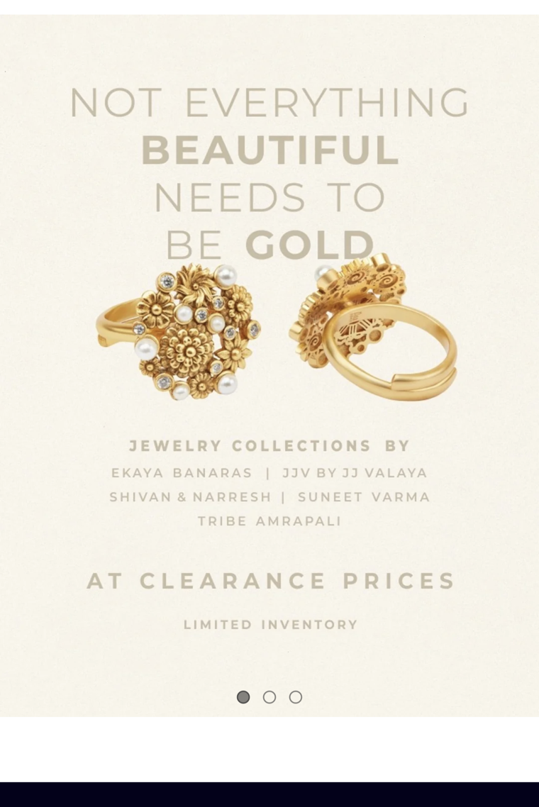
Aulerth hero
FIG 1.2 Hero — riddle headline + clearance framing

Aulerth has a genuinely distinctive voice — "Towards 2042," "Change is Precious," "Not everything beautiful needs to be gold." This is a brand with a point of view, which is rare and valuable. The problem is coherence: the same screen that whispers premium-sustainable also shouts 50%-off clearance, and the tagline reads as a riddle rather than a promise.

Two brand voices contradict each otherCritical
Issue

Luxury-sustainable positioning collides with aggressive discount messaging (promo bar + "clearance prices" + "50% & above"). To a first-timer this signals "discount outlet," undercutting both premium and ethical credibility.

Recommendation

Lead with the value (sustainable, designer-led), make clearance a clearly-scoped secondary lane. Let the brand promise own the first screen.

"Towards 2042" is unexplainedModerate
Issue

A intriguing tagline with no nearby meaning. Curiosity without payoff becomes noise for someone who doesn't know the brand.

Recommendation

Pair it with a one-line decoder ("Our pledge to a gold-free future") at first appearance.

What works: The voice is ownable and memorable — a real asset most jewellery sites lack. The fix is focus, not reinvention.
02

Imagery & Assets

Photography, product visibility, asset quality
5.5
Designer grid
FIG 2.1 Designer grid — faces, not pieces
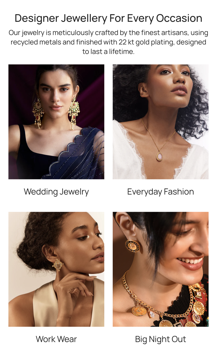
Occasions grid
FIG 2.2 "For Every Occasion" — model-led tiles

The photography is editorial and aspirational — easily the page's strongest craft asset. But it is working against the business. Section after section leads with a model's face rather than the jewellery, so the actual product is small, secondary, or absent. For a first-timer trying to answer "what do they sell and is it for me?", beauty without specificity creates a wall.

Faces dominate; products are incidentalCritical
Issue

Tiles in "Top Designers" and "Every Occasion" foreground portraits; the jewellery is often hard to read at thumbnail size. The hero shows two rings but the page never shows a clean, shoppable product.

Recommendation

Introduce at least one true product-led row (clean PDP-style shots, hover/secondary detail) so pieces — and craftsmanship — are legible.

No proof imagery for the eco claimModerate
Issue

The "recycled brass / 22kt gold plating" story is told in text only — no process, material, or certification visuals to make it believable.

Recommendation

Add a short "how it's made" visual strip (reclaimed source → artisan → finished piece).

What works: Image quality, lighting and casting are premium and consistent — the raw asset library is excellent.
03

Spatial Structure

Layout, spacing, rhythm, density
6.0
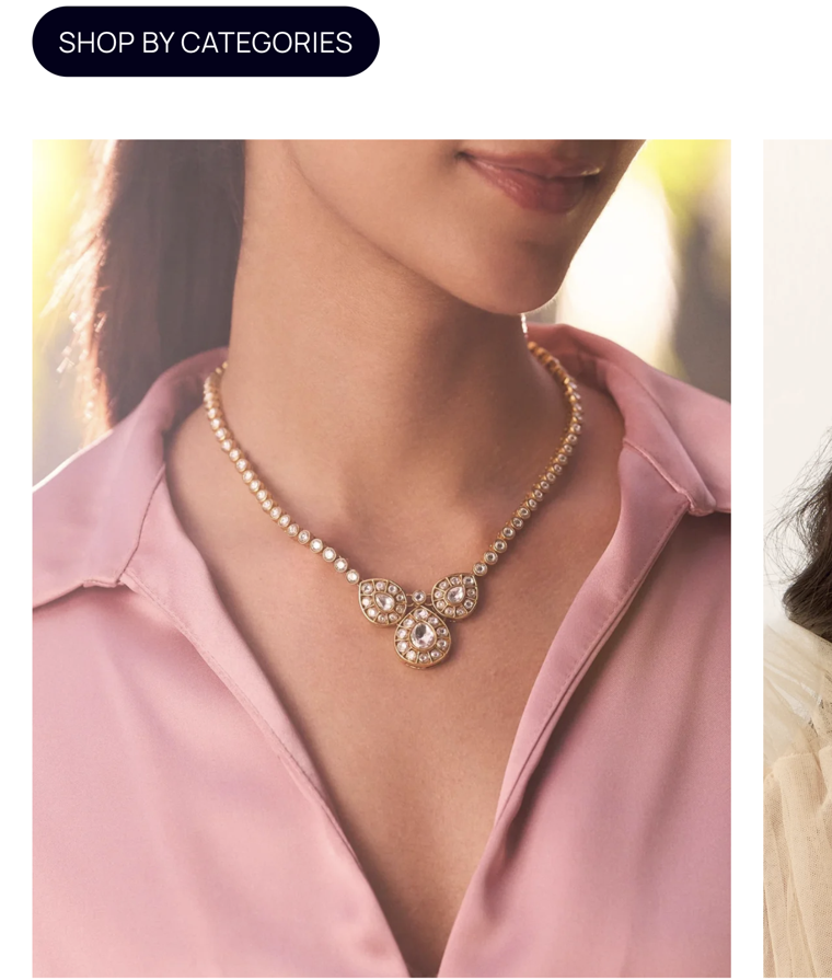
Shop by categories
FIG 3.1 "Shop by Categories" block
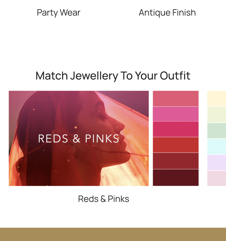
Match to outfit
FIG 3.2 "Match to Your Outfit" — late, novel module

Spacing and alignment are competent and the page breathes. The weakness is rhythm and length: the homepage is very long and built from a stack of near-identical 2-column image grids (Designers, Categories, Occasions), so sections blur together and the page feels repetitive rather than progressive.

Repetitive grid pattern flattens the pageModerate
Issue

Three consecutive grid sections share the same visual treatment, causing pattern-blindness — the eye stops distinguishing one section's purpose from the next.

Recommendation

Vary module formats (carousel, editorial split, single-feature banner) to give each section a distinct shape and job.

Excess length defers key contentModerate
Issue

Critical trust/value content sits far down a long scroll; many first-timers never reach it.

Recommendation

Tighten to a purposeful sequence; promote eco-proof and a product row above the midpoint.

What works: "Match Jewellery to Your Outfit" is a genuinely fresh, useful module — a structural high point worth elevating.
04

Usability

Findability, targets, CTAs, trust, accessibility
4.8
Header icons
FIG 4.1 Small menu / search targets
Clearance block
FIG 4.2 "50% & above" — no visible CTA / destination

This is the lowest-scoring lens and the one most directly tied to lost conversions. The page is admired more than it is used: navigation is hidden, calls-to-action are weak or implicit, and the trust signals a first-time buyer needs are absent.

Primary navigation hidden behind a small hamburgerCritical
Issue

A browse-first newcomer must tap a small icon to discover the catalogue; search is an equally small glyph. Fitts's Law: small, important targets cost time and taps.

Recommendation

Expose 3–4 top categories as visible entry points; enlarge tap targets to ≥44px.

Ambiguous / missing calls-to-actionCritical
Issue

The hero offers carousel dots, not a button. The "50% & above" block has no visible CTA or clear destination. The user must guess what is tappable.

Recommendation

One unambiguous primary CTA per section ("Shop the Edit," "Explore Clearance").

No trust signals for a cold visitorCritical
Issue

No returns/shipping reassurance, no authenticity/quality guarantee, no reviews near the value claim. First-time + sustainability skepticism = high need for proof.

Recommendation

Add a trust strip (returns, hallmark/quality, secure pay) and surface reviews/ratings.

What works: Cart, account and search are present and conventionally placed — the scaffolding is correct, it just needs prominence.
05

Arrangement & Hierarchy

Priority, emphasis, reading order
5.3
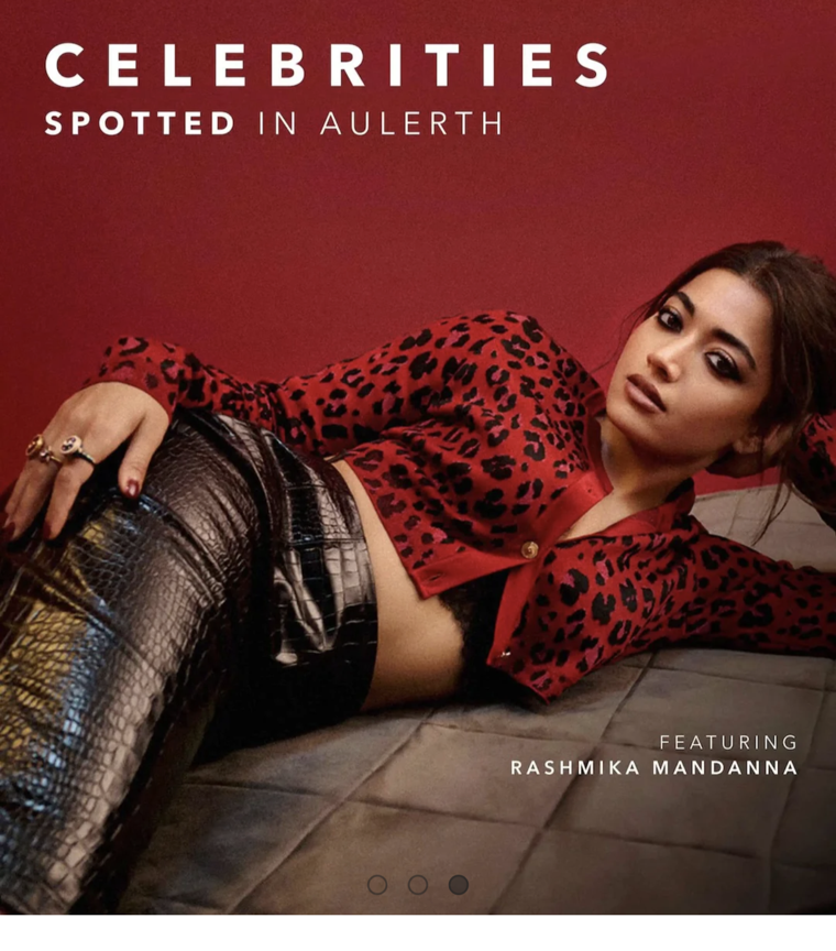
Celebrities section
FIG 5.1 Celebrity slot, high on the page
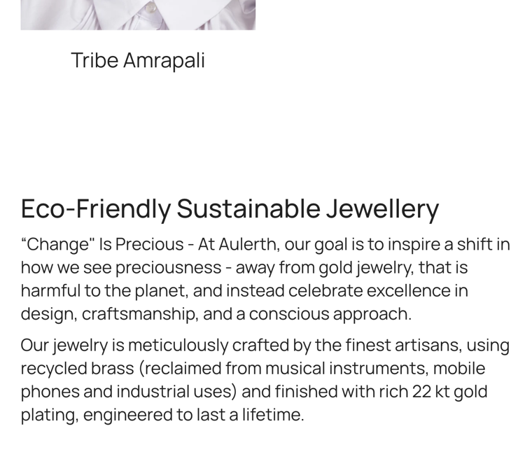
Eco story
FIG 5.2 Eco story — the real differentiator, buried low

The page's emphasis is inverted for our persona. Discount and celebrity content win the prime real estate; the sustainability narrative — the single most differentiating, trust-building asset — is pushed far down. The hierarchy optimises for impulse, not for the considered, values-led decision this buyer is making.

Differentiator demoted below promosCritical
Issue

"Change is Precious" / recycled-brass story appears ~5 scrolls down, after clearance, celebrities, and designer grids. Serial-position effect: the most persuasive content lands where attention is lowest.

Recommendation

Promote a condensed eco value-prop into the first 1–2 screens.

Too many co-equal prioritiesModerate
Issue

Clearance, celebrity, designers, categories, occasions and colour-matching all compete at similar weight — no clear "if you do one thing, do this."

Recommendation

Define a single primary path; subordinate the rest.

What works: Celebrity social proof (Rashmika Mandanna) is a strong trust lever — it's well-shot, just over-prioritised relative to substance.
06

Lettering & Text

Typography, contrast, legibility, copy
5.5
Hero typography
FIG 6.1 Gold-on-cream hero — low contrast
Eco paragraph
FIG 6.2 Dense eco paragraph

Typography is tasteful but prioritises mood over readability. The hero's gold text on a cream field is likely below WCAG AA contrast; tracked-out all-caps and the long, unbroken eco paragraph add cognitive load right where comprehension matters most.

Low-contrast hero textCritical
Issue

Muted gold/tan headline on light cream fails to meet AA (4.5:1) contrast — the brand's first words are the hardest to read, especially in sunlight on mobile.

Recommendation

Increase contrast (darker ink or a scrim) to clear AA; verify on-device.

Dense paragraph carries the key messageModerate
Issue

The eco value-prop — the most important copy for this buyer — is a wall of text that invites skimming-past.

Recommendation

Break into a headline + 3 scannable proof points (recycled · 22kt plated · artisan-made).

Decorative all-caps tracking reduces speedMinor
Issue

Wide-tracked uppercase labels look elegant but slow reading and weaken scannability.

Recommendation

Reserve all-caps for short labels; use sentence case for anything longer than 3 words.

What works: The serif/sans pairing is elegant and on-brand; type sizes in body sections are generally comfortable.

03 User Journey Audit

Scroll by scroll, through Meera's eyes.

We walk the page as our first-time, sustainability-led visitor experiences it — capturing what she sees, what she feels, where she hesitates, and the psychology behind it. ⚑ marks a flagged drop-off risk

S1Landing & Hero
Hero
SCROLL 1 First screen
FrictionHigh
Laws at play
Aesthetic–Usability EffectJakob's LawHick's Law

What she sees: A beautiful, muted hero — two rings, an elegant riddle ("Not everything beautiful needs to be gold"), a list of designer names, and "at clearance prices." Carousel dots, no button.

What she feels: "Pretty… but what is this? Is this gold or not gold? What do I do here?" Admiration, then mild confusion. The page looks trustworthy because it's beautiful — but offers no action.

  • Headline is poetic, not orienting — purpose isn't clear in the critical first 2 seconds.
  • No primary CTA; the only implied action is "swipe the carousel."
  • "Clearance prices" immediately reframes a premium brand as a sale — dissonant with her eco-luxury expectation.
⚑
Drop-off risk — HIGH.

Ambiguous hero + no clear entry action is the classic above-the-fold bounce. If she can't answer "what is this and what do I do?" in seconds, she leaves.

Bright spot: The aesthetic earns a few seconds of goodwill — enough runway to convert if a clear next step existed.
S2Celebrity Proof
Celebrities
SCROLL 2 Celebrities spotted
FrictionMedium
Laws at play
Social Proof (Cialdini)Halo Effect

What she sees: "Celebrities Spotted in Aulerth," featuring Rashmika Mandanna.

What she feels: "Okay, it's legitimate / aspirational." A credibility bump — but it speaks to fame, not to her values. It answers "is this cool?" not "is this responsible?"

  • Strong proof, but mis-targeted for this persona — celebrity ≠ sustainability evidence.
  • Still no path to act or to learn what makes Aulerth different.
Bright spot: Genuine, high-quality social proof early — valuable, just placed ahead of the substance she's actually seeking.
S3Clearance Block
Clearance
SCROLL 3 50% & above
FrictionHigh
Laws at play
AnchoringPrice-Quality HeuristicBanner Blindness

What she sees: A dark "Clearance — 50% & above" section with a model image and no obvious CTA.

What she feels: "Is this an outlet brand?" The third discount cue in three scrolls anchors her on cheapness, quietly devaluing the craftsmanship and ethics she came to evaluate.

  • Repeated discounting triggers the price–quality heuristic in reverse — low price implies low value.
  • No CTA / unclear destination — she can't act even if interested.
  • Still nothing about sustainability; her core motivation remains unaddressed three scrolls in.
⚑
Drop-off risk — HIGH.

For a values-led buyer, an outlet-feeling page erodes the premium-ethical trust she needs. Discount-led framing this early can disqualify the brand in her mind before she ever sees its best argument.

S4Top Designers
Designers
SCROLL 4 Semi-precious by top designers
FrictionMedium
Laws at play
Authority BiasHick's LawLaw of Similarity

What she sees: "Semi-Precious Jewellery From Top Designers" — a grid of designer names over model portraits (JJ Valaya, Suneet Varma, Shivan & Naresh, Ekaya Banaras, Tribe Amrapali).

What she feels: "Impressive names." Authority lands — but if she doesn't know Indian couture designers, the names mean little, and she still can't see actual pieces or prices.

  • Designer-led, not product-led — for a newcomer, names without pieces don't aid a buying decision.
  • Faces over jewellery again; the items remain hard to evaluate.
  • Five near-identical tiles invite choice paralysis with no guidance on where to start.
Bright spot: The designer collaborations are a powerful credibility and quality signal — strong substance, weak merchandising.
S5The Eco Story
Eco
SCROLL 5 "Change is Precious"
FrictionCritical
Laws at play
Serial-Position EffectCognitive LoadGoal-Gradient

What she sees: Finally — "Eco-Friendly Sustainable Jewellery," the "Change is Precious" story: recycled brass from reclaimed instruments/phones, finished with 22kt gold plating, built to last.

What she feels: This is what I came for. Interest spikes — then doubt: "Recycled brass with plating… will it tarnish? Is it actually valuable? Where's the proof?" A dense paragraph, no certification, no visuals.

  • Her primary motivation is satisfied only after 5 scrolls — most first-timers never arrive here.
  • The claim raises quality/authenticity objections it doesn't answer (no proof, process, or guarantee).
  • Wall-of-text delivery dampens an emotional high point that should be the page's climax.
⚑
Drop-off risk — CRITICAL.

The single most persuasive, on-motivation moment is buried below the fold and under-supported. This is the biggest conversion leak: the brand's best argument reaches the fewest people, and even then fails to close the trust gap. Surface it early and back it with proof.

Bright spot: The narrative itself is excellent and rare — a true differentiator. The problem is purely placement and proof, both fixable.
S6Categories & Occasions
Occasions
SCROLL 6–7 Shop by category / occasion
FrictionMedium
Laws at play
Paradox of ChoiceLaw of ProximityMiller's Law

What she sees: "Shop by Categories," then "Designer Jewellery for Every Occasion" — many tiles: Wedding, Everyday, Work Wear, Big Night Out, Bridal, Gifting, Party Wear, Antique Finish.

What she feels: "Lots of options… where do I start?" Useful navigation arrives at last, but the sheer count plus repetitive format dilutes momentum rather than channelling it.

  • Eight+ occasion tiles exceed comfortable chunking (Miller's ~7±2) without prioritisation.
  • This is the page's real "way in" — but it appears very late in the scroll.
  • Tiles still lead with models; pieces and prices remain unseen.
Bright spot: Occasion-based merchandising matches how people actually shop for jewellery — a smart frame, placed too low.
S7Match to Outfit & Exit
Match
SCROLL 8 Match to your outfit
FrictionLow
Laws at play
Peak–End RuleVon Restorff Effect

What she sees: "Match Jewellery to Your Outfit" — a colour-led module (e.g., "Reds & Pinks") with swatches. Fresh, distinctive, genuinely helpful.

What she feels: "Oh, that's clever." A positive last impression — but it arrives after she's likely already decided whether to stay.

  • The most novel, memorable module is the last thing she sees — its differentiating power is wasted at the bottom.
  • By Peak–End logic, the journey's emotional shape is: admire → confuse → doubt → (maybe) delight — a fragile arc.
Bright spot: This module is a signature idea. Pulled higher, it could become a primary, ownable entry point into the catalogue.

The emotional arc of the scroll

Mapping Meera's confidence-to-act as she descends the page. The line should climb; instead it dips exactly where discounting and ambiguity stack up, and the on-motivation peak lands too late.

HighLow S1 Hero S2 Celebs S3 Clearance S4 Designers S5 Eco S6 Categories S7 Match

Two of the three confidence peaks (Eco, Match) — the brand's best assets — sit in the back half of the page where the fewest visitors remain.


04 Recommendations

What to fix, and in what order.

Combined recommendations, bucketed into UI (craft & surface) and Experience (flow, trust & structure). Each carries an impact and effort read. Tackle the high-impact / low-effort items first.

◑ UI & Craft

Surface-level fixes to the interface itself.

U1

Fix hero text contrast to WCAG AA

Darken the headline or add a subtle scrim so the brand's first words clear 4.5:1. Verify on-device in daylight.

Impact: HighEffort: LowQuick win
U2

Add one unambiguous CTA per section

Replace implied taps with explicit buttons — "Shop the Edit," "Explore Clearance," "Discover How It's Made." No section should leave the user guessing what's tappable.

Impact: HighEffort: LowQuick win
U3

Enlarge nav & search targets; expose categories

Hit ≥44px tap targets and surface 3–4 top categories in the header so a browse-first newcomer has a visible way in.

Impact: HighEffort: Med
U4

Introduce a product-led row

At least one section with clean, shoppable product shots and prices — so pieces and craftsmanship are legible, not incidental to a portrait.

Impact: HighEffort: Med
U5

Vary module formats & trim length

Break the three-grid monotony with mixed layouts (carousel, editorial split, single feature) and cut the overall scroll depth.

Impact: MedEffort: Med
U6

Make the eco copy scannable

Convert the dense paragraph into a headline + three proof points (Recycled brass · 22kt gold-plated · Artisan-made to last).

Impact: MedEffort: LowQuick win

◐ Experience & Flow

Structural fixes to journey, trust and priority.

E1

Promote the sustainability story above the fold

Move a condensed "Change is Precious" value-prop into the first 1–2 screens. Lead with the reason this persona arrived, not with the discount.

Impact: Very HighEffort: MedTop priority
E2

Add proof to the eco claim

Pair the recycled-brass story with a "how it's made" visual, a quality/tarnish guarantee, and certification — answer the objections before she forms them.

Impact: Very HighEffort: MedTop priority
E3

Rebalance discount vs. premium messaging

Demote clearance to a clearly-scoped secondary lane. One discount cue, not three above the fold, so price stops anchoring perceived quality.

Impact: HighEffort: LowQuick win
E4

Add a first-time-buyer trust strip

Returns, shipping, quality guarantee, secure payment, and review ratings — placed near value claims to close the credibility gap for cold visitors.

Impact: HighEffort: LowQuick win
E5

Clarify the hero into a promise + path

Keep the poetic line, but add a plain-language sub and a primary CTA so purpose and next step are clear within 2 seconds.

Impact: HighEffort: LowQuick win
E6

Elevate "Match to Your Outfit" as a signature entry

Pull this novel, ownable module higher and turn it into a guided, shoppable path — a differentiated way into the catalogue.

Impact: MedEffort: Med
E7

Define one primary path; subordinate the rest

Pick the single most important action and build hierarchy around it instead of many co-equal sections competing for attention.

Impact: HighEffort: Med

Prioritisation — impact vs. effort

Start top-left. The quick wins (E3, E4, E5, U1, U2, U6) cost little and move trust and clarity immediately; the strategic bets (E1, E2) are the largest levers and deserve dedicated effort.

Impact →
High impact · Low effort — DO FIRST High impact · High effort — PLAN Low impact · Low effort — FILL-IN Low impact · High effort — AVOID E1 E2 E3 E4 E5 E6 E7 U1 U2 U3 U4 U5 U6
Effort →
Strategic bet (Experience) Quick win (Experience) Plan (Experience) UI / Craft

A pragmatic sequence

Phase 1 · Now

Stop the leak

  • Fix hero contrast (U1)
  • Add CTAs per section (U2)
  • Rebalance discounting (E3)
  • Add trust strip (E4)
  • Clarify hero promise (E5)
Phase 2 · Next

Build trust & clarity

  • Promote eco above fold (E1)
  • Add eco proof / how-it's-made (E2)
  • Scannable eco copy (U6)
  • Product-led row + prices (U4)
  • Enlarge nav, expose categories (U3)
Phase 3 · Later

Differentiate & refine

  • Define one primary path (E7)
  • Elevate "Match to Outfit" (E6)
  • Vary module formats, trim length (U5)
  • Re-test journey with first-timers
✦

The assets are already excellent — the photography, the designer roster, the genuine eco story. The work isn't to add beauty. It's to get out of its own way: lead with the reason people came, prove it, and give them an obvious door to walk through.